Lesson 5: Summarizing Data
Opening Story
Lesson 5 - Opening story
(1:22
mins, L5 Opening Story Transcript)
Summarizing Data
Information surrounds us. In the introductory video, we heard a conversation between Lucas, Amanda, and their doctor. Even in a simple conversation like this one, a lot of information is exchanged. We need to be able to make sense of the information we hear. Knowing how to make sense of information is a highly valued skill in today’s workplace. It is also an important trait of the wise consumer, the informed citizen, and the educated individual. Making sense of information is usually called summarizing data. We summarize data every day in many ways, but the goal is always to give an improved understanding of a situation.
One example of summarizing data was seen in the introductory video when Amanda stated, “The doctor has been gone a really long time.” Lucas replied, “I wouldn’t worry about it. The longest we’ve ever had to wait is 15 minutes.” This comment is a concise summary of all of their previous visits to the doctor’s office. It allowed Lucas to comfort Amanda by referencing their past experience in a concise way.
L05 - Interactive 1: Summarizing Data
(L05-1
ADA Interactive Transcript)
In this lesson we will learn some of the most commonly used tools for summarizing data. We will also learn how to use how to use Excel to help us do these calculations.
Tools for Summarizing Data
Basic statistical calculations can help us summarize information, especially when that information consists of numbers. We will be discussing how the minimum, maximum, mean, median, mode, standard deviation, and percentiles can help us summarize information.
Minimum and Maximum
First, let’s look at the minimum and maximum. The minimum and maximum are common ways of summarizing the most extreme values that have occurred in a given scenario.
The minimum value in a list of observations is the smallest value that occurs.
The maximum value in a list of observations is the largest value that occurs.
The minimum and maximum help us see what values are possible, since we would expect all the other observations to be between these two extremes.
Example 1
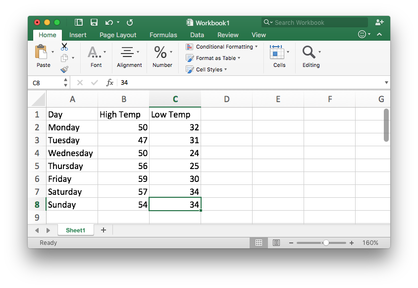
Look at any weather report and you will typically see the high and low temperatures reported. Here is an example of a typical weekly weather forecast. Find the minimum and maximum temperatures for the week and explain what they tell us.

Solution
We see the high and low temperature for each day listed. If you compare
the predicted high temperatures for each day of the week, you will see
the largest (or highest) temperature of 59° Fahrenheit is predicted to
occur on Friday. The smallest (or lowest) temperature of 24° Fahrenheit
is predicted to occur on Wednesday. Therefore the maximum temperature is
59° F and the minimum temperature is 24°F. We would expect all other
temperatures during this given week to be between 24°F and 59°F.
Excel Instructions - Maximum and Minimum
Follow these steps to learn how to calculate the maximum and minimum in Excel:
Step 1
Open a “New Workbook” in Excel.
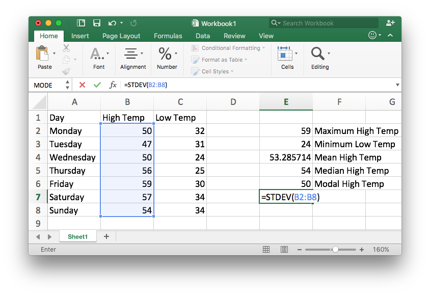
Step 2
Type in the data for which you want to calculate the minimum or maximum. For this example, we will use the predicted high and low temperatures shown in the typical weather forecast depicted in the example above.
Step 3
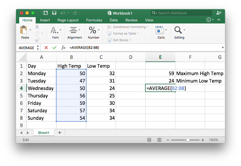
In any blank cell of the document
- type the command
=MAX( - use your mouse to highlight the data you are interested in
- and finish typing the closing parentheses
)
For this example, this gives: =MAX(B2:B8)

Step 4
Press Enter (or return) and the cursor will
move to the next line with the result for the maximum of 59°F now
showing.
Repeat the above process using the =MIN( command to
obtain the minimum.

Step 5
Labeling these values is optional, but helpful for remembering what they are.

Mean, Median, and Mode
The mean, median, and mode are ways of summarizing the most typical values that have occurred in a given scenario. They are often called measures of center because they give a good feel for the values that are “right in the center” of all of the observed values.
The mean is more commonly referred to as the average. It is calculated by adding up all of the values and dividing by the total number of values. It is good for summarizing the center of values that are generally very similar to each other.
The median is the middle number in a list of numbers that is sorted from smallest to largest. Thus, fifty percent of the values are lower than the median and fifty percent of the values are larger than the median. It is good for summarizing the center of values where most of the values are similar but some are dramatically higher (or lower) than the rest.
The mode is the value that occurs most often in a list of numbers. It is good for summarizing data that only has a few distinct values that are possible.
Example 2
How long does a human pregnancy last? The common answer is 9 months, but we know that not every pregnancy is the same length. Should you use the mean, median, or mode to describe the length of human pregnancies? Why?
Solution
The mean (or average) is a good estimate of the length of pregnancies because most pregnancies last about the same amount of time.
The mean length of a pregnancy is 266 days from conception (or 38 weeks). This mean could be calculated by taking the number of days every pregnancy lasts and dividing by the total number of pregnancies. The mean, or average, is a good estimate of the length of a pregnancy because two-thirds of pregnancies are within 2 weeks of this estimate. In other words, the lengths of most pregnancies are very close to 266 days even though a rare few are much longer or much shorter than that.
(Note that sometimes the last menstrual period rather than date of conception is used to predict a pregnancy. In this case, the mean is two weeks longer, i.e., 280 days, or 40 weeks.)
Example 3
What is a typical household annual income? We know that not every household has the same income, so we need to summarize this data in order to understand it better. Should you use the mean, median, or mode to describe household income? Why?
Solution
The median is often used to summarize incomes for a given region. For example, a news headline stated, “Worldwide, Median Household Income About $10,000”1. This is because while most people earn around the same amount of money each month, with some earning more than others, there are yet others who earn extraordinarily more money than the rest of us. The median income is reported in order to keep the extremely high incomes from skewing the results. Thus, the median income gives a better feel than would the mean for what most people actually make.
To demonstrate further, a survey of 183 BYU-Idaho students2 showed that the median hourly wage of students was $9.02 an hour. The mean hourly wage was $10.81, but was skewed by a student who stated they were earning $100.00 an hour! The median is a better representation in this case of the typical hourly wage of BYU-Idaho students. Remember, 50% of students will earn less than the median wage and 50% will earn more than the median wage.Example 4
If you have ever tried to find a certain size of clothing at a store you may have noticed that some sizes are more commonly sold than others. But not all clothing sizes are the same size, so we can summarize this information to get a better idea of what clothing sizes are available. Should you use the mean, median, or mode to describe available clothing sizes? Why?
Solution
This is an example of the mode, or the most commonly occurring clothing sizes. The mode is a good value to use because there are only a few sizes possible.
To demonstrate further, some data from college students in the U.S.3 shows that the modal shoe size (most commonly occurring shoe size) for females is size 8. The modal size for males is size 11. If you go to a shoe store you will probably find a better selection in these sizes than you would in less common sizes.
Excel Instructions - Mean, Median, and Mode
Follow theses steps to calculate the mean, median, or mode in Excel:
Step 1
Enter the data into Excel. For this example, we will continue using the weather data from the previous Excel Instructions where we found the maximum and minimum values.
Step 2
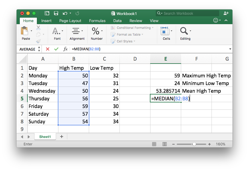
To compute the mean:
- type the command
=AVERAGE(in a blank cell - highlight the data you are interested in
- finish by typing the closing parentheses
)and pressingEnterorreturn.
Step 3
To compute the median:
- type the command
=MEDIAN(in a blank cell - highlight the data you are interested in
- finish by typing the closing parentheses
)and pressingEnterorreturn.
Step 4
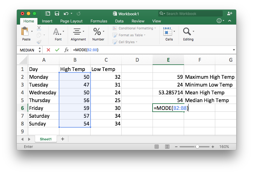
To compute the mode:
- type the command
=MODE(in a blank cell - highlight the data you are interested in
- finish by typing the closing parentheses
)and pressingEnterorreturn. - Note that Excel just finds one mode and there might be more than one.
Step 5
The final result is as follows.

Standard Deviation
The standard deviation helps us know how close to the mean all the values in a data set are. This is helpful because it tells us if all the points in a data set are close together or if they are very spread out.
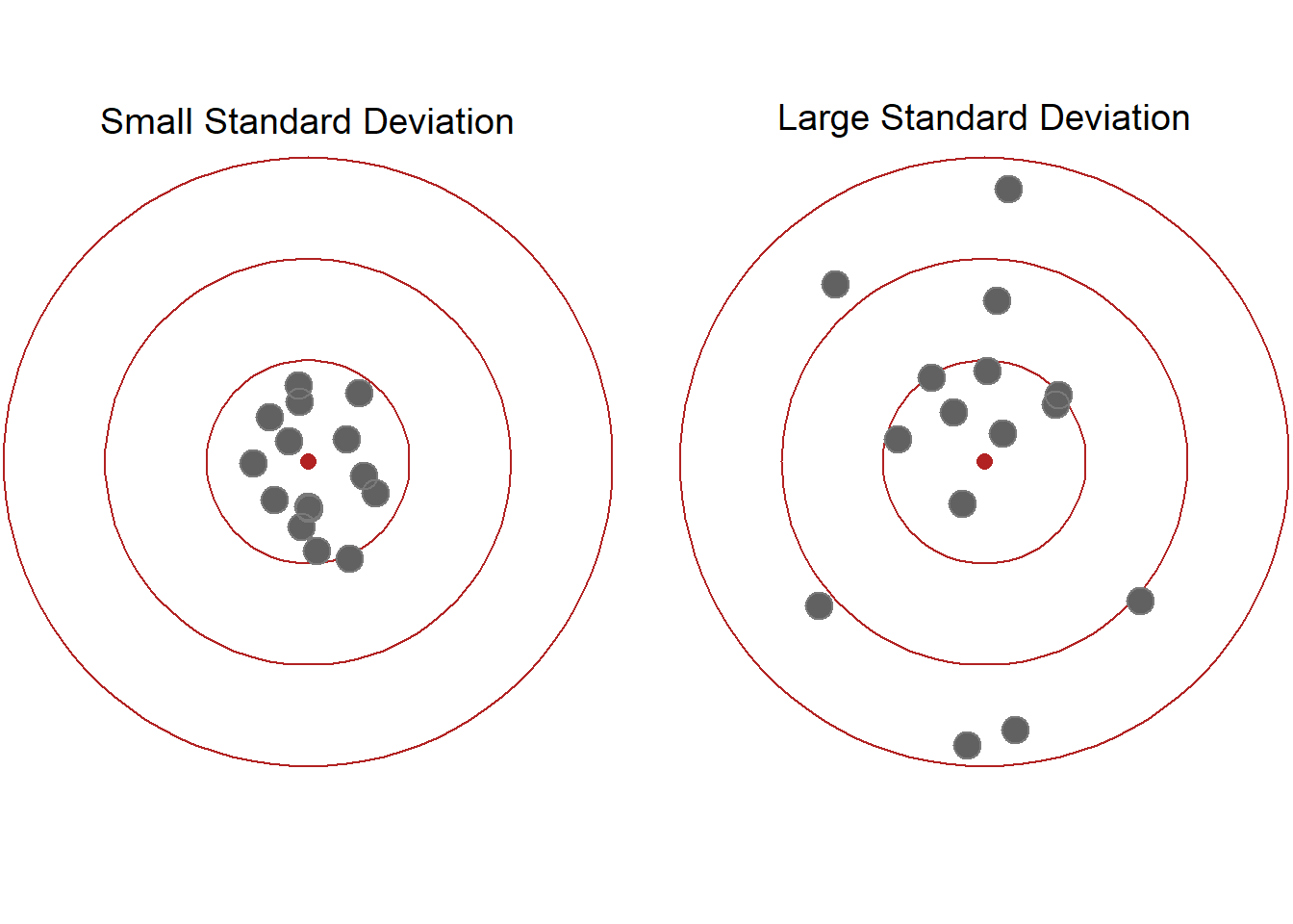
The standard deviation is a summary of how much values vary from the mean of a set of data. When the values are all very close to the mean, the standard deviation is small. When the values vary dramatically from the mean, the standard deviation is large.
The following diagram demonstrates the idea of standard deviation. In each picture, the red dot in the center represents the mean. Notice in the diagram representing a small standard deviation most of the points are quite close to the mean. In the diagram representing a large standard deviation we can see the points are quite spread out and not as close to the mean.
Example 5
Consider the following two sets of data: a) all the daily high temperatures in 2016 in Honolulu, Hawaii, or b) all the daily high temperatures in 2016 in Rexburg, Idaho. Which set of data would have a larger standard deviation? Explain.
Solution
We know that the temperature in Hawaii is pretty similar all year long.
But the temperature in Idaho varies a lot. In the summer the high
temperature in Rexburg might be 95°F while in the winter the high
temperature might only be -10°F.
During 2016, the average annual temperature in Honolulu, Hawaii was 84.09°F and the standard deviation was 2.97°F. The warmest days of the year were July 14 and August 12, 2016. On both of those days the high temperature was 91°F. The coldest day of the year was December 30th when the high temperature was 75°F. 4
During 2016, the average annual temperature in Rexburg, Idaho was 57.33°F with a standard deviation of 22°F. The warmest day of the year was August 2, 2016 when the high temperature was 95°F. The coldest day of the year, however, was on December 17th when the high temperature was only 4°F.5
If we compare the standard deviations for Honolulu and Rexburg, we see that Honolulu’s standard deviation of 2.97°F is much smaller than Rexburg’s standard deviation of 22°F. This tells us the temperatures in Honolulu are usually much closer to the average when compared to the temperatures in Rexburg that vary a lot from the average.
Excel Instructions - Standard Deviation
To compute the standard deviation in Excel:
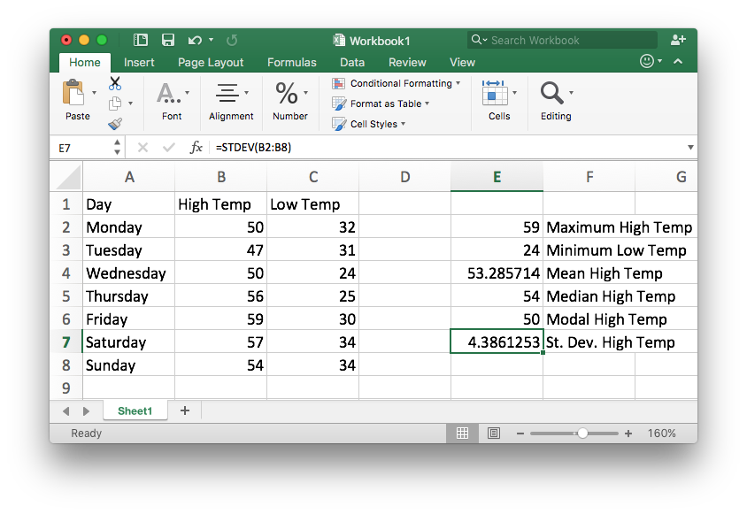
Step 1
Open your data in Excel,
- type the command
=STDEV(in a blank cell - highlight the data you are interested in
- finish by typing the closing parentheses
)and pressingEnterorreturn.
Step 2
The result is as follows.
Percentiles
Percentiles help us see how a certain value compares to all the other values in a set of data.
A percentile measures the percentage of values that are the same as or less than the specified value. They are typically used to measure the performance of an individual with respect to their peers.
Context is very important to consider when looking at percentiles. Being at the 5th percentile might be good, it might be bad, and it might not be significant at all. It really just depends on the situation. You should never consider a percentile without looking at the related context.
Example 6
Juan took a standardized test and then was told that he scored at the 82nd percentile. Interpret what the percentile means.
Solution
Knowing that Juan’s score was at the 82nd percentile helps us understand how he scored compared to the other students who took the standardized test. We know he scored as well or better than 82% of all the people who took the test. This means 18% of students who took the test scored better than Juan did. Juan’s percentile score does not tell us his actual score on the exam. It only tells us what percentage of students he scored higher than (or the same as).
Example 7
In the introductory video we heard the doctor tell Lucas and Amanda that their daughter Emmy is in the 4th percentile for girls her age. Explain what this means.
Solution Since Emmy is in the 4th percentile we know that out of all the baby girls her age, only 4% weigh the same or less than Emmy does. That means 96% of the babies weight more than Emmy. We could also think of it as: 4 out of every 100 babies will be the same weight or smaller. The doctor noted: “It is something to keep an eye on, but it’s actually not that unusual.” In this case the context is very important, the doctor does not just use a percentile to make a decision about Emmy’s care. He will also consider other indicators of her health.
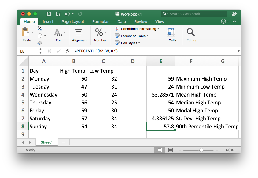
Excel Instructions - Percentiles
To compute a percentile in Excel:
Step 1
Open your data in Excel,
- type the command
=PERCENTILE(in a blank cell - highlight the data you are interested in
- type a comma
,and the desired percentile as a decimal like0.9 - finish by typing the closing parentheses
)and pressingEnterorreturn.
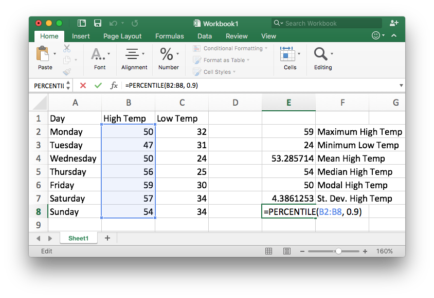
Step 2
The result is as follows.
Putting it All Together
Now that we know how to compute numbers that summarize data we can use these tools as part of the quantitative reasoning process to help us make an informed decision. Let’s go back to Lucas and Amanda and their experience at the doctor in the introductory video. At the end of the video we heard the doctor say; “I don’t think we need to be concerned unless it worsens. We’ll watch her progress closely.” (Note: This scenario is based on a real situation, but keep in mind that just having a low percentile for weight is not necessarily a cause for concern.)
Understand the Problem
Emmy hasn’t been eating well and has spit up a lot after she eats. Lucas and Amanda’s were concerned about Emmy’s weight. They want to decide how to proceed to care for Emmy to ensure that she is healthy.
Identify Variables & Assumptions
The variables of interest in this situation include:
- How often Emmy spits up
- Emmy’s weight
- Emmy’s height
- The expense of doing medical tests
Lucas and Amanda need to make a few assumptions:
- Emmy’s weight and height are an indication of her health
- Emmy’s weight and height are going to continue to be smaller than average
- Emmy is going to continue to spit up often
Apply Quantitative Tools
The percentile is a useful statistical tool in this situation. Knowing that Emmy’s weight is in the 4th percentile helps Lucas and Amanda understand how her weight compares to the weight of other babies her age. The chart the doctor showed is also a helpful tool because it gives them a visual tool to understand Emmy’s weight. Lucas and Amanda understand that percentiles should always be considered in context. Just being small isn’t necessarily a concern, but because Emmy is also not eating well and spitting up a lot they are wondering if something is wrong.
Make an Informed Decision
After discussing things further with the doctor, Lucas and Amanda decide not to do any medical tests at this time. The doctor wants to watch Emmy’s progress, but he is not overly concerned. Lucas and Amanda are worried about doing medical tests because the tests are not covered by their health insurance and they would have to pay about $100 each for the six tests the might apply. Based on their doctor’s recommendation, they decide to wait and see if Emmy’s weight improves.
Evaluate Your Reasoning
After carefully considering their decision, discussing it with the doctor, and praying about it, Lucas and Amanda are comfortable with their decision.
In two months they return to the doctor to follow up on Emmy’s progress. At that visit they find that Emmy’s weight has dropped to the 2nd percentile for baby girls her age. She is spitting up more often and has other signs of poor health. Based on this new information, they re-discuss their decision with the doctor and decide to go ahead and do the tests. The doctor helps them find a clinic where the tests can be done for less money than they would be at the hospital.
The tests come back and show that Emmy has a small health issue that is able to be fixed with medication. In a follow up visit a few months later Emmy’s weight has increased to the 15th percentile for baby girls her age.
This example used the percentile as a tool to help understand Emmy’s weight. In this case the doctor did the computation required and reported the percentile to Lucas and Amanda. In other cases we will find that Excel is a helpful tool for us to use as part of the Quantitative Reasoning Process when we want to find the minimum, maximum, mean, medium, mode, standard deviation, or a percentile.
Lesson Checklist
At the end of this lesson, you should be able to do the following:
- Use Excel to calculate the minimum, maximum, mean, median, mode, standard deviation, and a percentile.
- Interpret the maximum and minimum as measures of the extreme values in a set of data.
- Interpret the mean, median, and mode as measures of the center in a set of data.
- Be able to determine whether to use the mean, median, or mode to find a measure of the center of a set of data.
- Interpret the standard deviation as a measure of variability of a set of data.
- Interpret percentiles as a way to compare an individual value to the rest of the data set.
- Use the minimum, maximum, mean, median, mode, standard deviation, and percentiles as a quantitative tool in the Quantitative Reasoning Process.